
Restaurant Dashboards Guide: The Tracking & Visibility You Need To Succeed
At Trusted CFO Solutions, our restaurant clients partner with us to elevate their business from low-level financial visibility to an eagle’s eye view, soaring above the details.
In this article, we’ll guide you through the slides of the dashboards and explain each, providing a glimpse of what it looks like to partner with Trusted CFO Solutions and leverage Sage Intacct. As we move through each section, we’ll summarize the dashboard view, and provide an overall description of how it benefits restaurants.
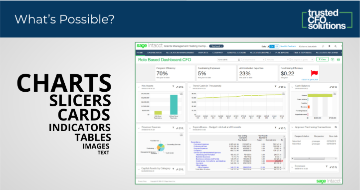
Dashboards: What Is It and How Does It Help?
…a dashboard is an executive information system user interface that (similar to an automobile’s dashboard) is designed to be easy to read (Wikipedia).
Dashboards View: CFO Snapshot
Within the general ledger system, you have transactions, and those usually roll up to reports. Sage Intacct brings into view a new dashboard, and with that dashboard, there are a few different things in addition to the reports you usually get.
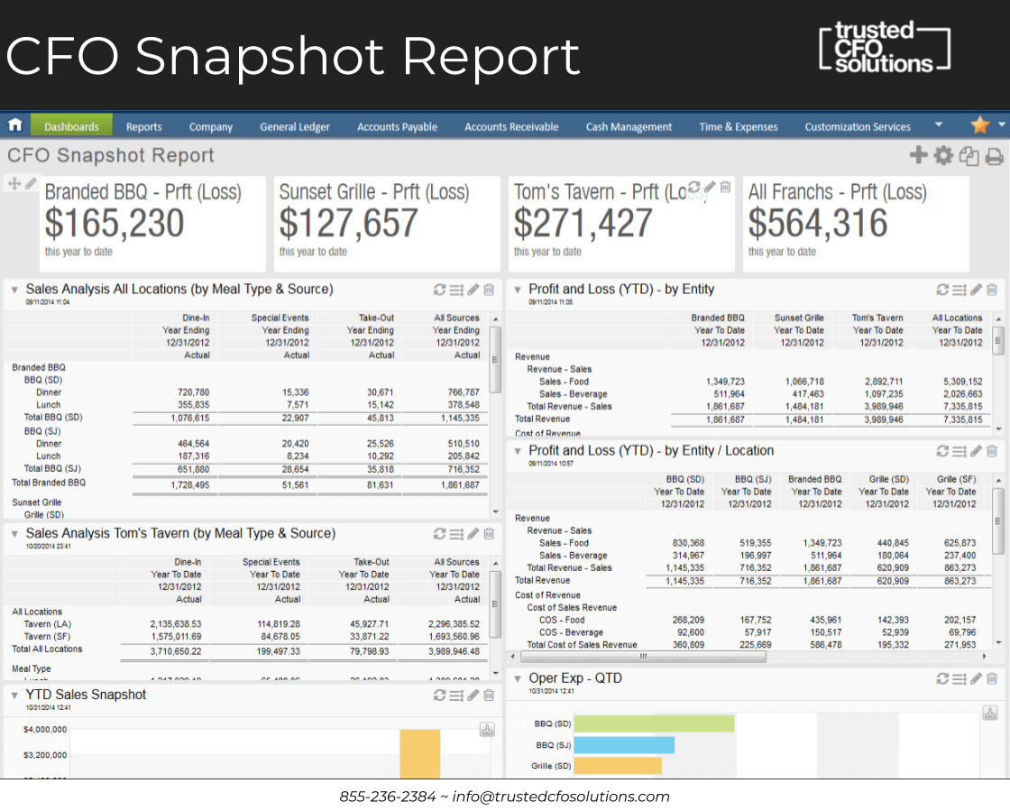
Most people close the books and run the report, but they don’t have many of the key metrics and data at their fingertips. We can add those key metrics and data to the dashboards with performance cards and graphs to make it a very rich storyboard, with Sage Intacct.
We Turn Dashboards Into Storyboards
Our goal is to turn our dashboards into a storyboard. We might need five different dashboards to analyze the business. As our goal and role, we want to wear the CFO hat to create the storyboard of their business. We work to develop dashboards that point out exceptions or things that aren’t in our expectations. At TCFOS we continually work to customize the reports, analyze them against the fiscal information, and put them right at our fingertips for presenting to our clients.
On this first CFO snapshot dashboard, the first thing we see is the profit and loss across the three different brands and the all in total. We see the first Branded BBQ, versus the Sunset Grill, versus Tom’s Tavern and then all three roll up into one. Usually, you have to open two or three different reports to see that information. The multi-entity environment of Sage Intacct allows us to filter and store based on multi-entity.
We can drill down into each one of these reports and get all the way down into the storage data to find where is it that is creating our variance. You start from the top of the dashboard, pick one of the reports, drill into it, drill down into the transactions, and then you slice and dice the data there.
Breakup with Excel And Save Time With Multi-Entity Bookkeeping
That’s the power of Sage Intacct turning a bookkeeping system into a CFO tool. Typically, CFO’s have to live in a world of Excel. Using a dramatic and powerful reporting writer with an inside view of the dashboards, CFO’s can do more without having to run all their reports. They usually can save several hours per day by having this tool at their fingertips.
Note again at the top of the slide you have the three entities and the roll-up total. Under Branded BBQ you have SF and SD. That represents two separate locations of the same brand. So, it is multi-unit. If you have more sites of the same brand, they will show underneath the brand.
If I clicked on that brand, I would see the different stores and their data. I could keep drilling down into each one and the data within. In fact, on the first report on the top left, you can see Branded BBQ, under Sales Analysis, and then you see dinner and lunch. If you chose a different location there, you could look at the results for Branded BBQ Store #1, Store #2, or Store #3. You could see it right there in the rows. We provide the CFO the data they need, so they don’t waste all their time in spreadsheets.
Analyze Sales Performance By Categories
While restaurants don’t have customers per se, they do have daily sales. Another financial accounting standards company might want to know what type of customers and if it is a substantial account. As a remedy, you could group your customer types as a whale type of customer. Then, when you see all your sales, you could have sales, customer type, whale, sales, customer type, medium, sales, customer type, and small. Then you could analyze the performance of each of those categories of customers. It’s not normalized when you look at it as a whole.
Customize Your Dimension Types
If you want to look at the same thing related to the operating expenses of your vendors, you need to know if your vendor is large or small. The customization of the dimension types is what is so vital to see at a glance how your business is performing based on your pre-set assumptions.
With the addition of a new customer, your customer count becomes important. At the top on the slide you see Sunset Grill. We could also say divided by the number of tables turns. So if we bring in a statistical account that says an average sale per table turn, we could put that at the top as a performance metric, a key metric of daily operations. That’s because we are adding statistical accounts of the table turns. That is the key driver of the business.
It’s the way you construct the data, roll it up in the report, group dimensions, and display it from a CFO perspective of slicing and dicing the performance and keeping it on track. That’s the beauty of the dashboard in Sage Intacct.
To access this information, it has to be set up correctly. So the data has to be brought in, structured, and organized as an important first step as part of the integration.
Get Visibility of Multi-Location And Compare To Boost Performance
On the second report down on the lower left is the sales analysis for Tom’s Tavern by all locations. You can see the two cities for Tom’s Tavern. One is LA (Los Angeles) one is SF (San Francisco). We can see the total of all sources, and that the LA division is doing 2.2M versus the SF location of 1.6M. Our question will become, “Where is the LA location beating the SF location?” We can look at dine-in, specials, and take-out as meal types to uncover the answer.
That’s the type of information that typically does not exist in a general ledger. Setting up the categories of sales with the capability to correctly bring those in is one of those reasons why we use a system like GetLinked. You usually would not think about meal type as items of sales, but that’s how we customize things for a client based on what’s driving it.
Access Operating Expenses For Multiple Locations and Compare Data
Lastly, on this slide, you see in the bottom right the operating expense of QTD (quarter to date). There are two listings for the BBQ locations, one in San Diego and one in San Jose. The operating expenses are high for the one in San Diego. If you look at the top, you see a comparison of what their sales are to that number. We could take it a step further and divide by some other sort of measure to get this data to be a little more meaningful. So, you could drill down into this, look at it and compare it in different ways, and see it based on a category or other dimension.
In this case, I want to know the percentage of food sales versus the percentage of beverage sales. I want to put that at the top of a revenue analysis dashboard. Therefore, when you start at the top to look at your measures, and you look at one report, the report on the right, it shows the food versus the beverage sales per locations. When you get to that point, you are usually analyzing sales or gross margin.
So we want to build another dashboard for gross margin to look at and analyze four different reports there. You want to trend it; to see the classification, by daypart, by meal types, and more. For that type of view, you go to another dashboard. Then slice and dice down into the lower level detail. That data is what CFO’s usually have to dump into Excel and add it all up. With Sage Intacct, they can go to a separate report or view and already see those graphs created as a snapshot of those key drivers.
Profit & Loss View
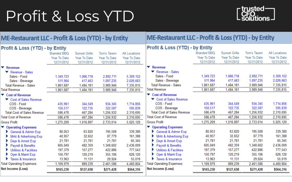
Drill Down For A More In-Depth Look
Profit & Loss, the next dashboard view is a drill down into that section from the previous slide. On this slide, there are two of the same reports on the right and the left. All the blue links are the ones you can drill into to get a more in-depth level look.
For instance, if you have questions on which day or which location or why would that be that number, you can drill down into the reports to get into the source transaction.
It’s usually tough to see it rolled up by an entity. If you were using QuickBooks, you would have to dump this stuff into Excel, add it up, and create a column. Still, it would not update live. Let’s say we found an error, went into the system and made a change. None of your reports would update.
Dashboards Give You Views of All Companies and All Locations At Once
With Sage Intacct, you can build these across multi-entity locations and see the multi-entity view for all entities. Also, if we wanted to group the locations by California, or by different states or territories, all we have to do is create a hierarchy and then run this report on that hierarchy, and you get the information. In Excel, you’d typically, have to map it precisely and it takes a long time to group that way. Sage Intacct is very flexible in the way that you can group and show things.
Sage Intacct creates that multi-tenancy view. To sum that up, you are in all the companies, all at once.
Controller Periodic View
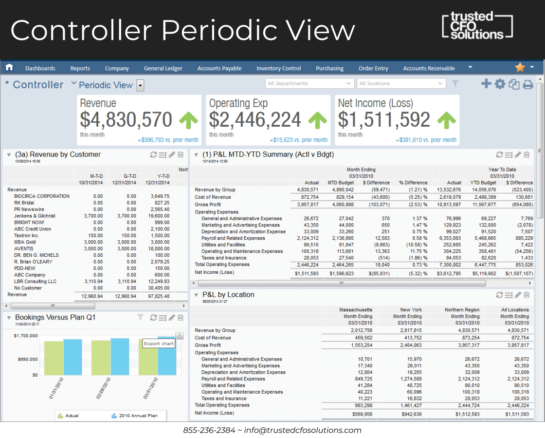
The Controller Periodic view is for every month or quarter. We want to see how the restaurant is performing. On this slide, it shows that revenue is up several hundred thousand dollars this month. That’s a good thing. You then ask, “Why is revenue up?” To find out you drill down into the next slide that would be the daily or monthly view. It shows that operating expenses are up. Then we ask, “Why are operating costs up compared to last month?” We want to figure that out, too. Then, we see net income is up.
So, our revenue is up, operating expenses are up, and net income is up. However, related to increased revenue, we look at—revenue by customer, on the left side. So which customers went up? Is it out of all those customers, that we have a spike? If we want to investigate why and explain it, this view gives answers.
Visibility of How You Are Tracking With Budget
Also, we might ask how are we doing compared to budget. So, on the right side, you see the Profit & Loss month-to-date and year-to-date summary for actual versus budget. You can see there is a difference. Are we below budget? Even though revenue is up year over year, we are actually under budget. The percent difference is 2.53%. Just because we are up from last month, that seems to trend better, but overall, where are we for the year? That’s what that report to the right will reveal.
Moreover, related to the Profit & Loss by location, you can see the locations across the top. What are those high-level revenues and the operating expenses by each location? You can break it up by which ones are up and which ones are down. You can see if you’re losing money. If it’s just one store that losing money, you can isolate it and quickly find the problem.
Combining Reports Saves Hours Per Day
The combining of many reports like this on the dashboard is excellent. It prevents you from having to run that report and get out of the other one, then run the other report and try to find that one, and then download that to Excel. That’s when all the scrambling happens. This benefit in Sage Intacct is where the COO’s and Controller’s who are trying to analyze performance save hours per day. They don’t have to run all those reports and dump that data to try to slice and dice.
You might ask who sets up these dashboards. Trusted CFO Solutions does much of the initial set up since that is our expertise. Then we teach the Controller how to use it. Over time they learn how to build reports and dashboards.
Controller Daily View
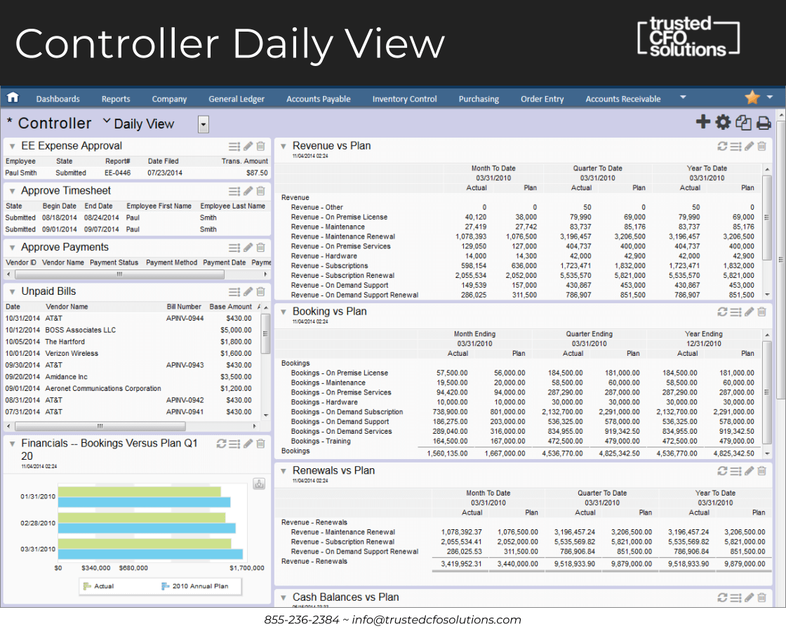
Experience Role-Based Views For Daily Tracking
This dashboard is the same periodic view, but with role-based views. Your CFO, Controller, and Operations Manager, typically have role-based views. Then they have a periodic versus a daily view. On the next slide, the Controller daily view provides what you need to see on what’s coming in today that requires approval. What expenses are there every day? You don’t necessarily look at the periodic view every day, but you’ve got to see what bills are unpaid, how you are tracking on revenue month-to-date versus the plan. Are you 80% there or are you 20% there? What do we need to do today?
So that Controller daily view is a lot different from the Periodic view. It’s much more practical and actionable on the approval side. You have your daily metric versus your periodic metric.
This is quite a timesaver in terms of approval of payments and bill pay. You don’t have an admin process these with a Controller, they just go through the dashboard. You can make your higher level function and value much more efficient and remove a lot of the clerk duties.
Purchasing Manager View
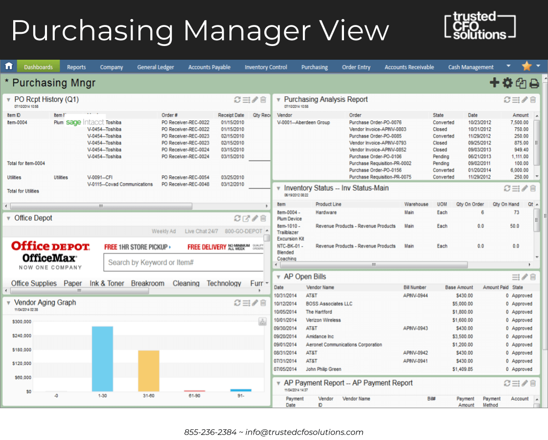
Know What You Receive, Order And Pay For Matches
A purchasing manager will want to know if they have purchase orders out and which ones they have received. Also, they will need to make sure what they ordered is what they received. The first block on the left is the PO Receipt History. Which purchase order have we received? They are reviewing and matching them when the bills get approved and are ready for payment. They are making sure payment made is only for things that are received and purchased.
Better Manage Your Approval Process To Reduce Aging Accounts
On the bottom right, the AP Open Bills provides the information of whether they are approved or not. If not, they need to be approving those. Then, we need to look at the vendor aging graph on the lower left of the slide to see how many bills are outstanding and unpaid — some of those they may need to say, not received yet.
Let’s say you’ve got a vendor graph that’s aging over 90 days, but you go up to the top, and you don’t have a receipt for it. Maybe you don’t have it marked as received, perhaps you haven’t received it, or something is wrong with it. You can see it all right here instead of having to ask three to four different departments the questions, “Did you get the bill yet? Did you pay the bill? Have you received the product?” All this information lives in Sage Intacct. You can look at a glance to see where you stand related to that purchasing manager role.
Create Data Views For People With Different Information
You can create different views for different people within a company that may not usually have access to this type of information. Because you can give them particular data views, you could assign different people different information that would be relevant to them, so they aren’t having to come to the person and ask them all the time.
Gain More Effective Communication Across Departments
One of the major problems we see across an enormous number of organizations is the communication between departments. Without Sage Intacct, it seems like the accounting department is a silo. It’s tough to communicate across departments when they can’t see the same data, and can’t log information into a general ledger system based on what they have to log manually into Excel every day. Then they send the Excel spreadsheet to accounting. Accounting can’t input the data as fast as it needs to be visible. The reports that come out of that are usually periodic. They are not every day, and then you have to send it back and forth. That back and forth creates a ton of inefficiency.
Send Notes To Do Away With Lost Communication In Email Inboxes
We see over 75% efficiency gained when non-financial members of other departments become part of the Sage Intacct views, and they can log their information there. It becomes incredibly efficient on the communication side of what happened on a transaction. Also, they can put all of their notes in there. Many organizations lose all that narrative tagged to the transactions when having to go back and forth communicating through email. Here, you’ve got users of Sage Intacct. You can send them a note to ask a question, and all that stuff is there and auditable instead of having it be lost or stuck in someone’s email box.
Use A System To Tag, Create And Track Communication
Instead, they get notified within the system that all the transactions are there. All the notes of all the transactions are there — notes like we received more, so we went ahead and put it to another invoice. Tag it to this, and this is the invoice number. This kind of crucial information is not usually trackable. But, with Sage Intacct, you can add all that narrative into these transactions, and you can easily see it when you drill down.
Know Your Most Relevant Key Metrics
It is vital, especially for restaurant dashboards, to have the critical relevant metric of how the organization runs and the ongoing improvement of those metrics. So, when you first launch Sage Intacct, you will think you have fifteen key metrics, and they never change. But that’s not how it works.
When you see data for the first time, you are going to make changes. You’re going to take actions and accumulate it differently. It’s going to make you want to change the way that you do it. It’s the ongoing process of change and creating a new metric for the organization. Your key metrics may die. It is best if you have someone who is adding things and removing things all the time.
Let Trusted CFO Solutions Help Create Your Success
Dashboards are what we are using at Trusted CFO Solutions to create a storyboard for our businesses that don’t have the time to analyze this every day. We analyze it, give them the exceptions, and let them take action on that organization. The tool is very sophisticated, so you need an organization that can help tweak it so you can take the actions and we can continue to monitor it.
Real-Time Visibility With Sage Intacct
Tags
Outgrowing Quickbooks?
Say goodbye to spreadsheet reporting and manual consolidations and start using a cloud-based financial management system.

Related Content

Wrap-Up: Reimagine Your Month-End Close with Sage Intacct

Best Practices to Perfect Your Month-End Close With Sage Intacct

Decoding the Challenges of the Month-End Close

Fast-Track Your Financials: Techniques to Slash Your Month-End Close

Take Control of the Month-End Close: A Checklist for Success
